top of page
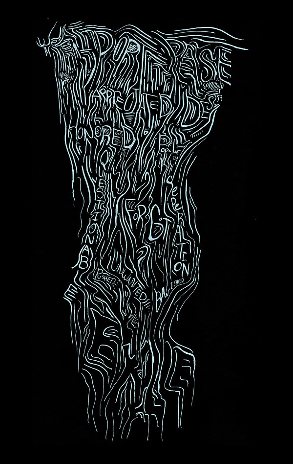
Kau (lit) / A project I worked on in my typography class at York University. The idea of kau developed from neon signs and old gothic letters. Using both forms to develop the lowercase font I created a typographic poster series that relate to connection between love, survival, and gratefulness.
Kau (lit) / A project I worked on in my typography class at York University. The idea of kau developed from neon signs and old gothic letters. Using both forms to develop the lowercase font I created a typographic poster series that relate to connection between love, survival, and gratefulness.
Posters
Through out my YSDN years I have made many posters that allowed me to develop my skills as a designer. As the years went on my skill turned into a personal style.


bottom of page