top of page
Kau (lit) / A project I worked on in my typography class at York University. The idea of kau developed from neon signs and old gothic letters. Using both forms to develop the lowercase font I created a typographic poster series that relate to connection between love, survival, and gratefulness.
Kau (lit) / A project I worked on in my typography class at York University. The idea of kau developed from neon signs and old gothic letters. Using both forms to develop the lowercase font I created a typographic poster series that relate to connection between love, survival, and gratefulness.
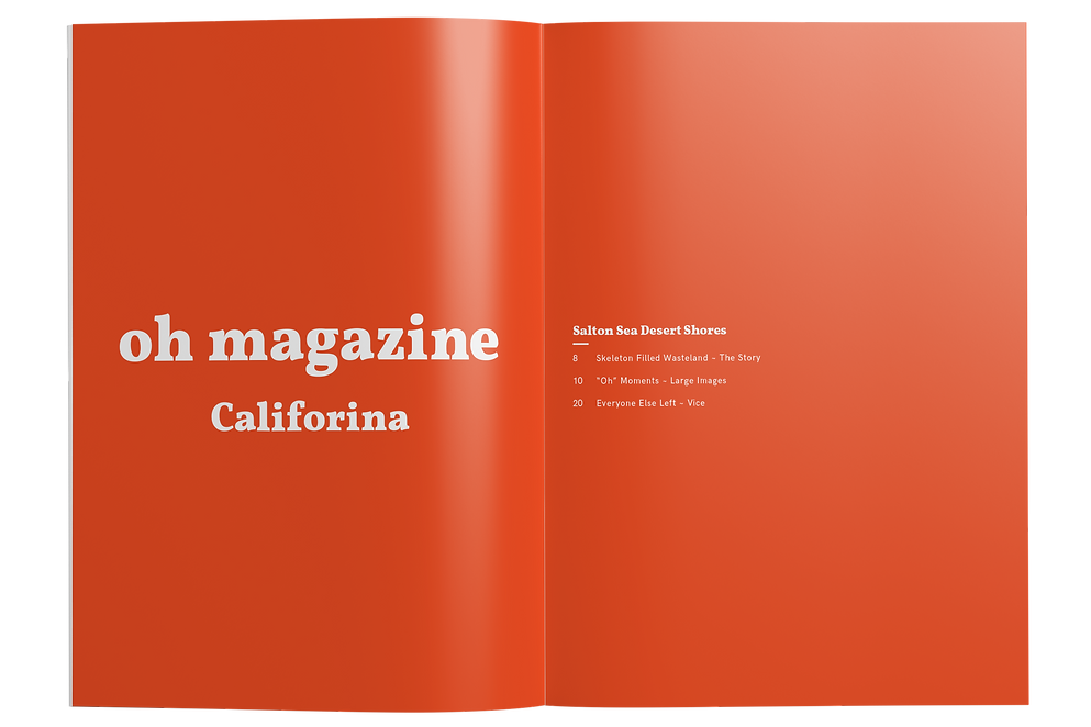
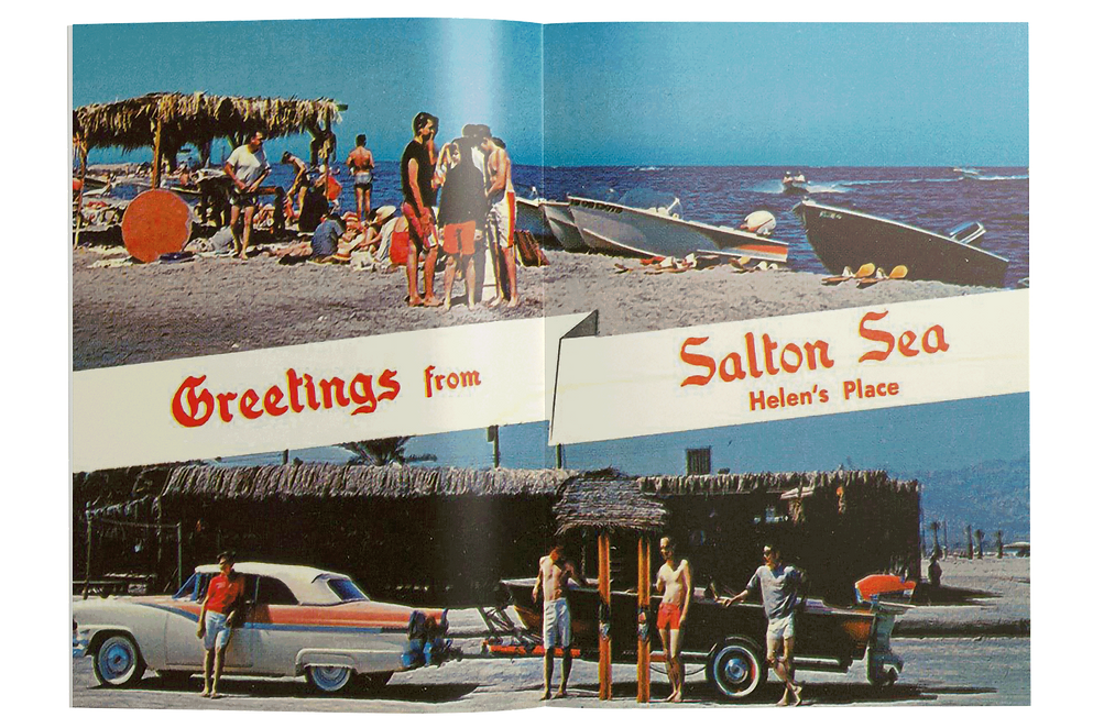
Oh Magazine
The magazine is about the word “Oh," it is used to express a range of emotions. So each issue will involve a story that express multiple emotions. I decided to use my photos I took in California this summer of Salton Sea. It is a town that is abandoned and while exploring through the homes I expressed many different emotions towards the town and I thought it would be a good magazine.


bottom of page