top of page
Kau (lit) / A project I worked on in my typography class at York University. The idea of kau developed from neon signs and old gothic letters. Using both forms to develop the lowercase font I created a typographic poster series that relate to connection between love, survival, and gratefulness.
Kau (lit) / A project I worked on in my typography class at York University. The idea of kau developed from neon signs and old gothic letters. Using both forms to develop the lowercase font I created a typographic poster series that relate to connection between love, survival, and gratefulness.
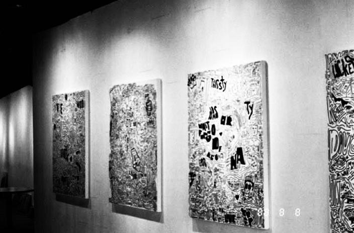
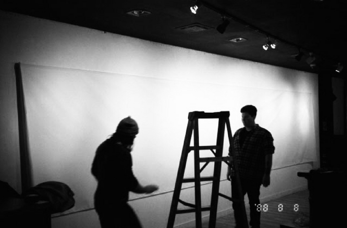
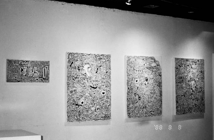
Hey Love Show
This was my last and final project I did in University. We were assigned an open-ended project with no restrictions. No restrictions was very exciting to me and I decided to go above and beyond by creating a personal brand and putting together an exhibit that showcases my typographic work.
My goal as a young designer and artist is to share my art with people and make people realize that they are not alone with life struggles. My art represents the joys and downs in life because I truly believe you need to have sadness in your life to know what happiness is.
Clothing Line


Social Media Advertisements

In Person Advertisments

Poster Advertisments


Photos From Event
bottom of page


